
Yesterday, I went along for another print session at The Ropewalk. My main aim was to print the second image for what will become the ‘Lincolnshire Coast‘ series of prints. In the previous post on this, I showed how the printing plate was made. Here, it’s all about the print.
Going back to the first principles of collagraphs, you may remember that the representation of light and dark tone is all about texture For this kind of plate, around half of which is rough textured (to print darker) and half smooth (to print lighter), the first inking of a new plate always takes a while. This is because I’m feeling my way around these contrasting textures with the inking cloth (scrim). At first, I ink the plate, using only black. As I apply the ink, at first the plate looks a little messy, as I have to spread ink over pretty much everything on the plate.
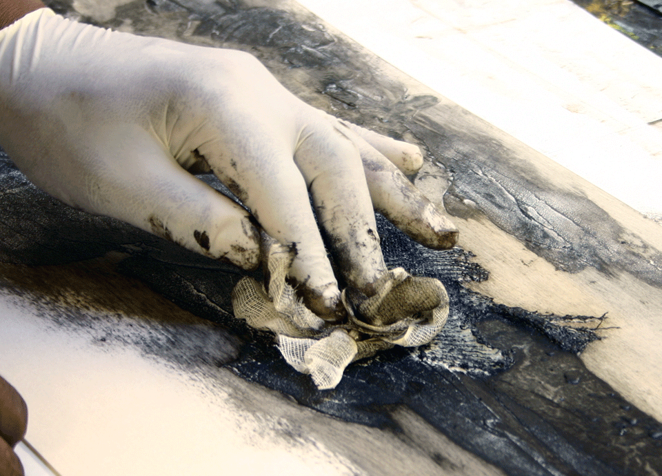
Gradually though, as I wipe over the smoother areas, the tones and textures begin to reveal themselves. Finally, as more ink is wiped away, the fine hairline cracks left by the use of crackle gel when the plate was made, come through. At this point, I know that the plate is nearly ready to print.
And, here’s are the print!…
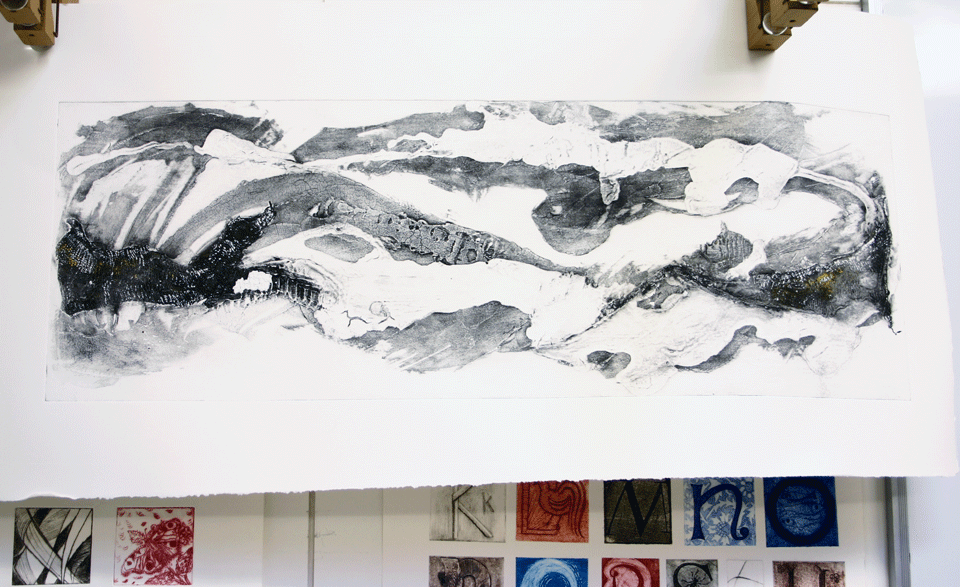
Looking at a new print is a strange sensation. This is particularly true when you have not been sure exactly how it might look. Initially, on the press, I wasn’t sure if I liked it had ‘worked’ or related to the first print in the series. I now know that my reservations were because I was literally too close to it on press. Once I hung the print on the drying rack and stepped back to view, only then did I see its true tonal and textural qualities.
Find all my posts about Art Printworks stories on Twitter at: #artprintstories