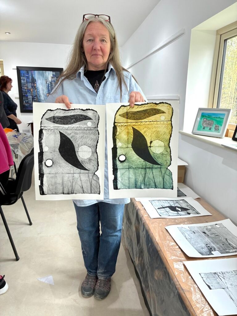


Today was a lovely change for me – instead of running a workshop, I was attending one! I was back at the Rickyard to do a one-day workshop, run by the brilliant artist Lisa Tank.
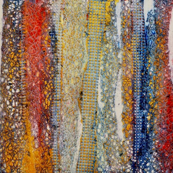
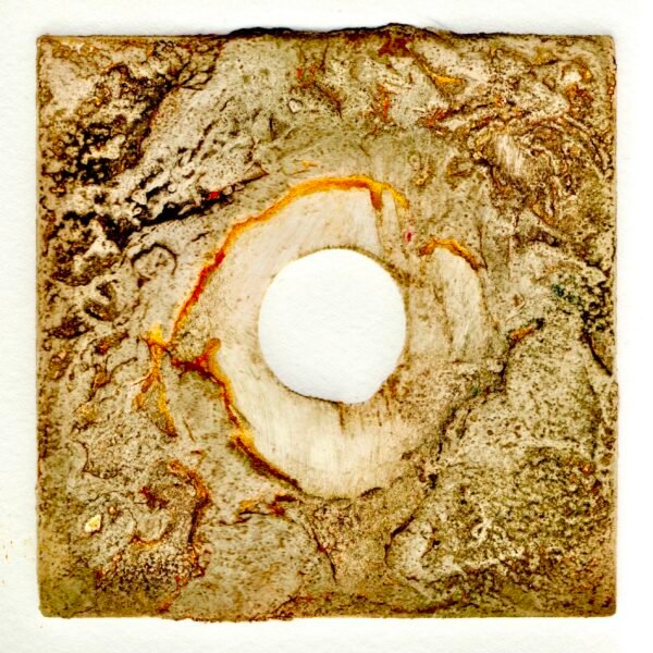
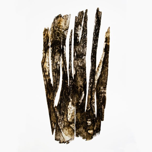
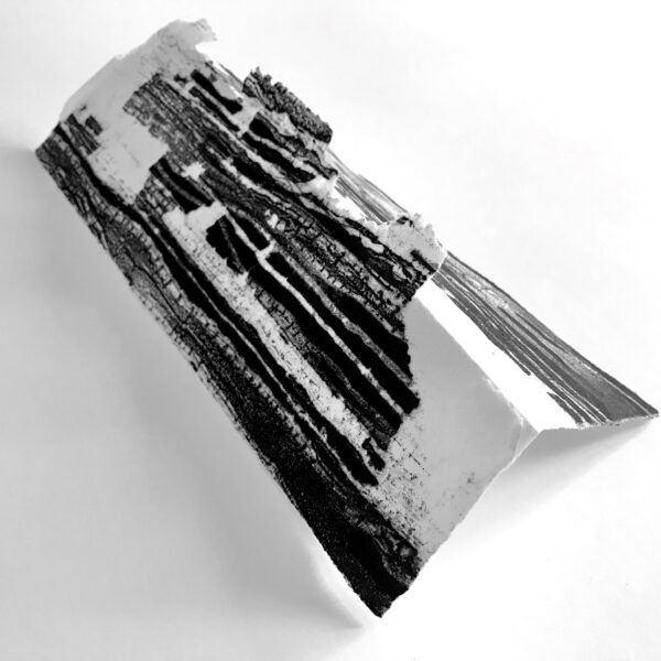
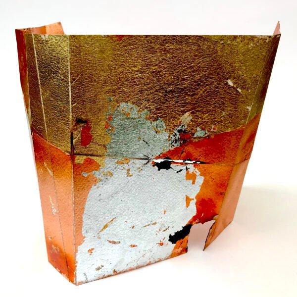
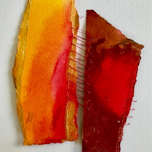
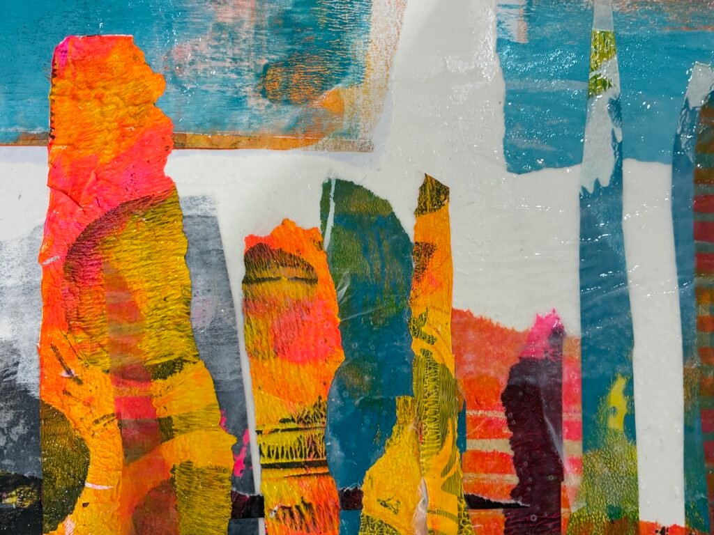
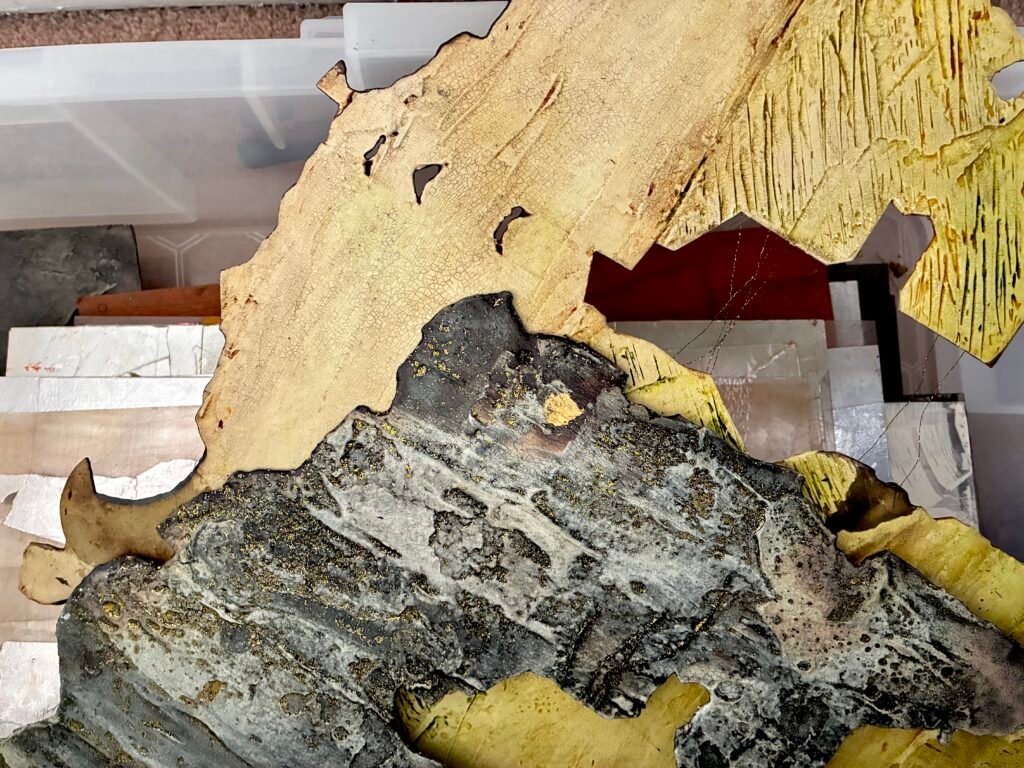
This year, I”ll be working on developing some work that combines part-printings, a variety of papers, including Japanese washi and Hosho papers and various collage techniques. I would like them to be larger in scale, which might be achieved joint smaller plates and/or prints together.
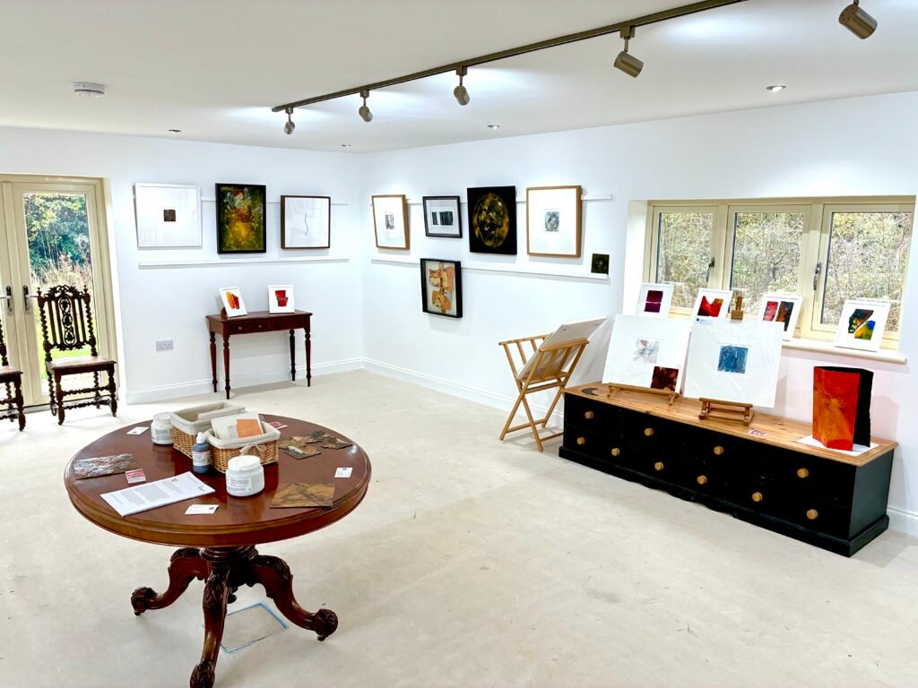
I recently ran what turned out to be brilliant one-day workshop at a local venue. The Rickyard Gallery is a relatively new arts centre to our area, and I was delighted that they agreed to host my major retrospective exhibition ’10’ in November last year.
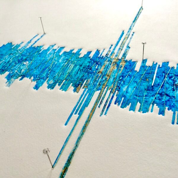
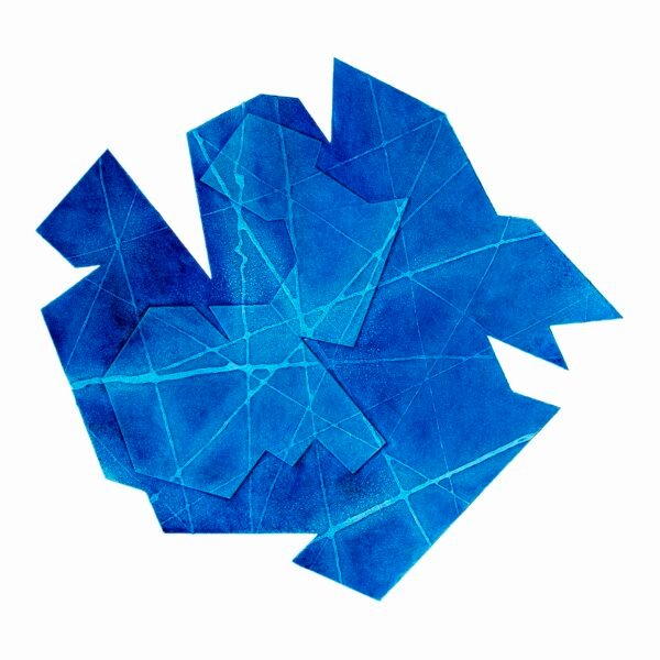
As the title ’10’: A Retrospective suggests, the exhibition was an overview of more than ten years of work, charting my evolution from straight up collagraph printer, to an artist-printmaker branching out into poured ink reliefs and folded paper sculpture.