
Nearly, but not quite
Nearly, but not quite
The final selections of prints for my ‘Anomalies’ exhibition have been made, the last few images are being framed and preparations and wall graphics have been prepared. I’ve sent exhibition notices and contacted galleries. But what about the images; the prints that didn’t quite make it – the ones that, whilst being good prints, didn’t quite fit in with the show’s theme, or sit well with an adjacent image?
Well, here are a few of them…

This one was a scaled-up version of a variation that was originally printed at 10cm square. It was interesting that the larger version, at around 25cm square, did not work as well. Something about the drama of the mark-making seemed to suit the smaller format. Definitely a ‘nearly, but not quite’.

With this one, I should have known (because I’ve tried it before), that the ink wouldn’t get to the edges of the rubber washers. Another example of something looking good on the plate, but not working on paper. Will I try it (and fail) again? Probably.

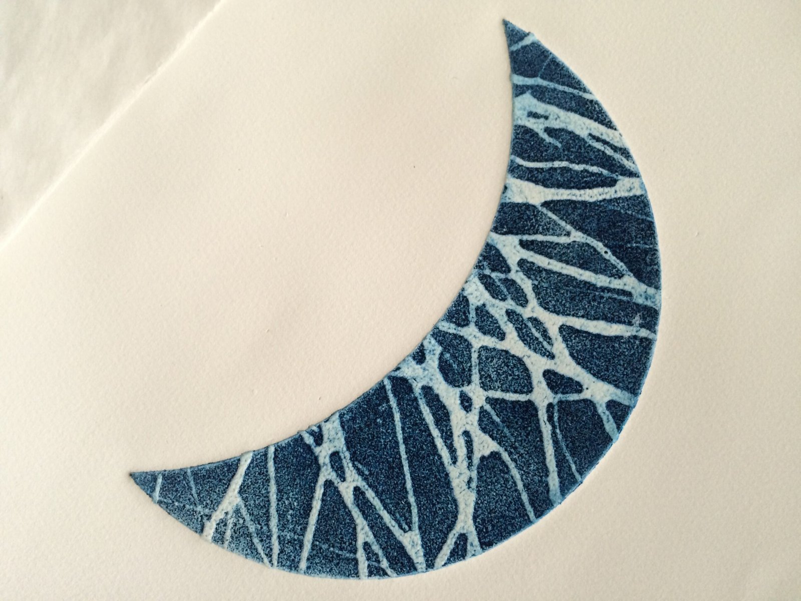
I will be using some crescent moons, just not these ones. It’ll be good to return to them later though.
[spacer height=”20px”]
In the meantime, please have a look at a filmed introduction on my printmaking, shot at The Ropewalk earlier this year. You can see it on:
You Tube https://youtu.be/zU8fnbvyJIw
Vimeo: https://vimeo.com/152998998
Follow the story of the exhibition at: #Anomalies16
Find all my posts about Art Printworks stories on Twitter at: #artprintstories


